Branding & Design
Identity, packaging and print, shaped around the character of each brand.
DE LA PAZ
Coffee Roasters, San Francisco
Visual identity, packaging, print and art direction
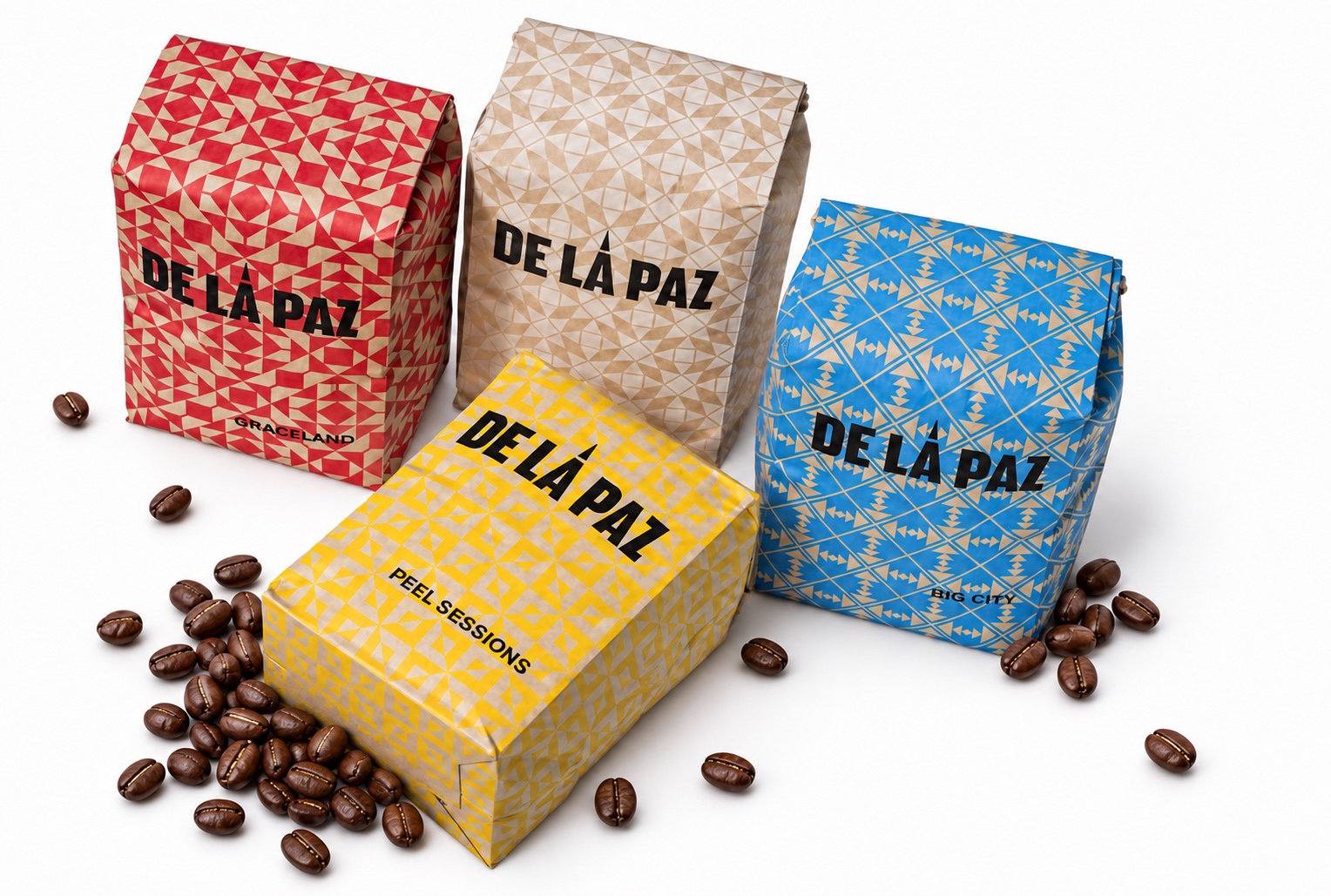
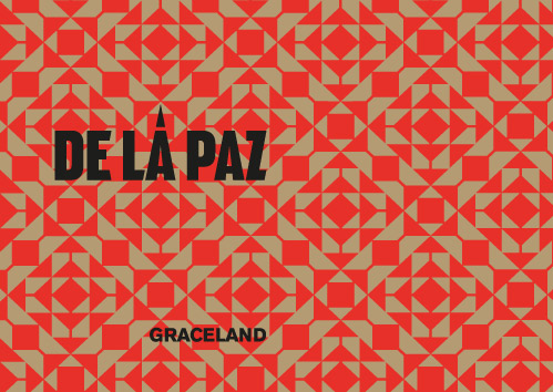
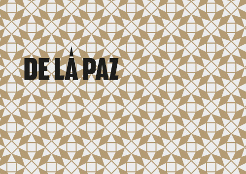
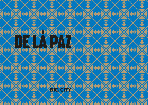
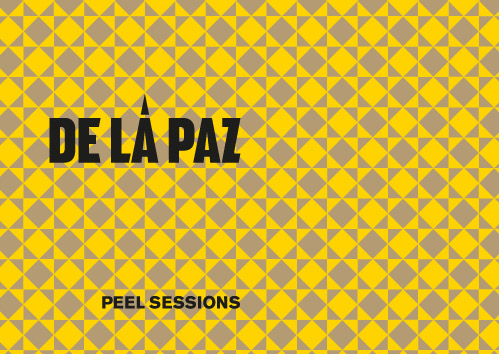
De La Paz is a coffee roaster based in San Francisco. My work encompasses visual identity, packaging, print and art direction. Bold black lettering and geometric patterns give each coffee its own character, while a consistent identity brings the range together.
SOFIA MINI
Sofia Wines
Visual identity, packaging, print and art direction
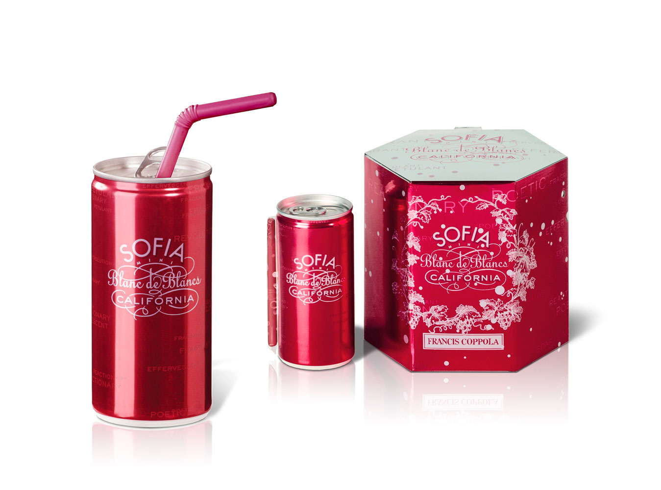
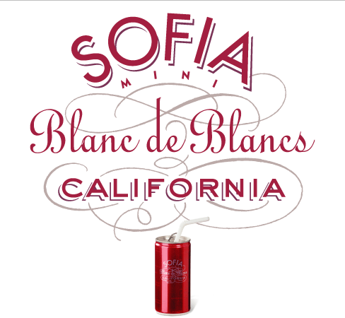
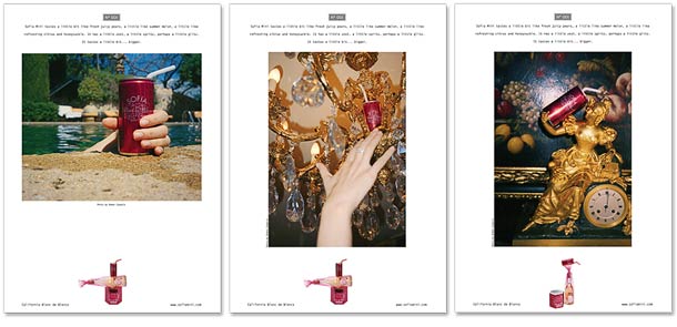
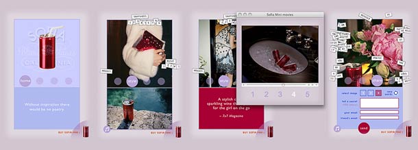
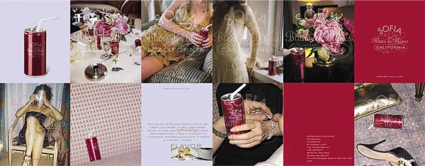
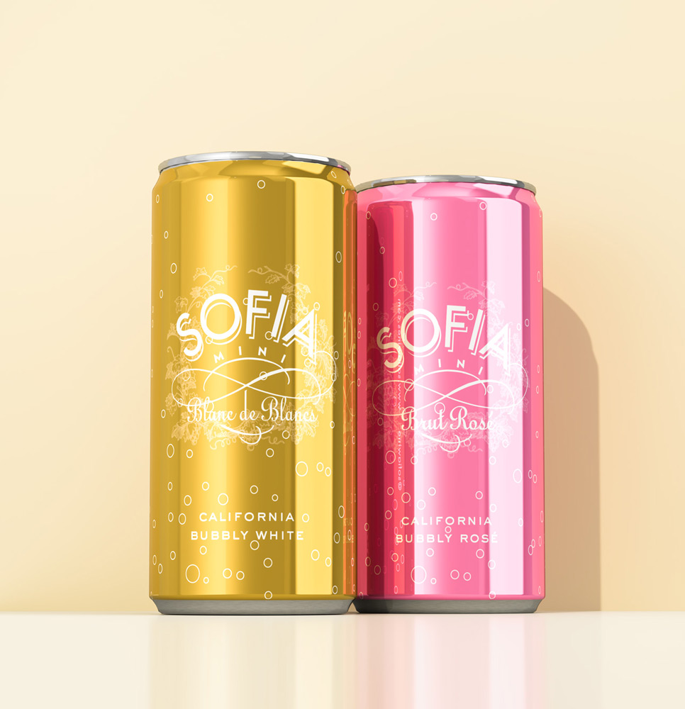
Visual identity, packaging, print and art direction for Sofia Mini, the first sparkling wine offered in a small 187 ml aluminum can. Metallic red cans, decorative lettering and a patterned gift box give the sparkling wine its distinctive character. The identity continues across printed pieces, advertising and digital materials.

SOFIA WINES
Product line redesign
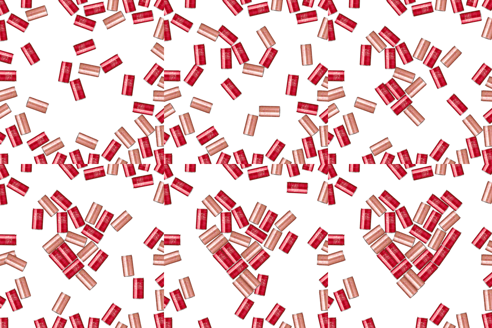
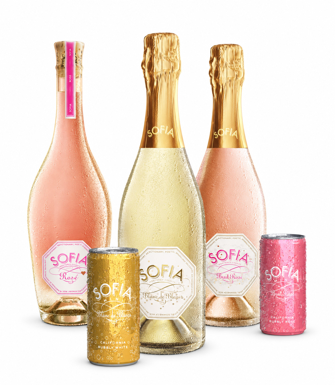
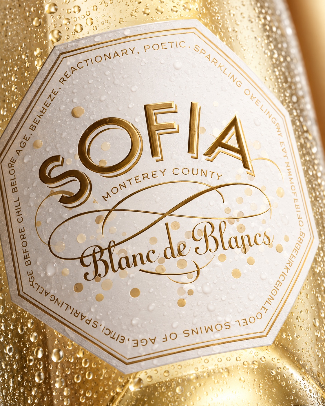
A redesign of the complete Sofia Wines product line. Coordinated lettering, label shapes and pink-and-gold details connect the bottles and cans across the range.
PALAZZO
MARGHERITA
Beauty Care
Visual identity and packaging
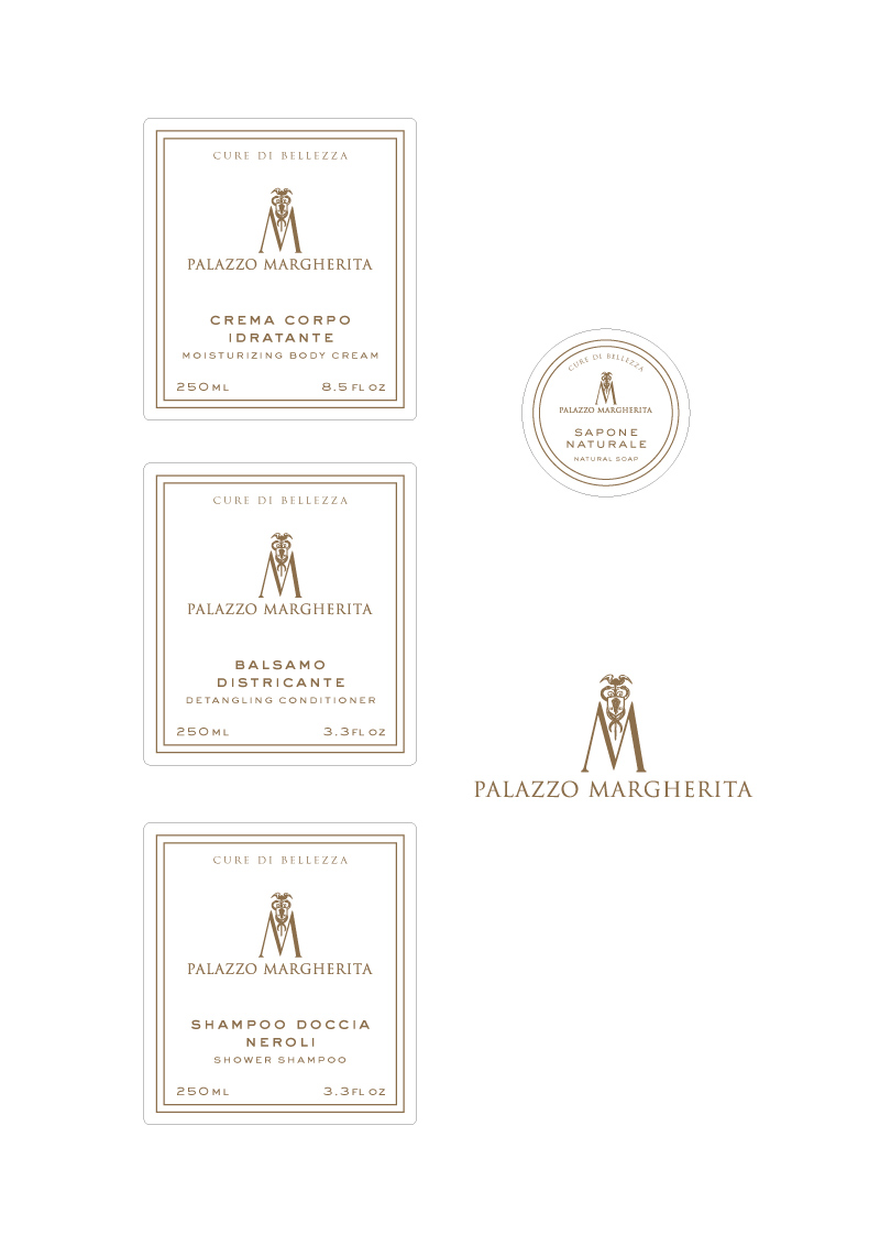
Visual identity and packaging for the beauty care collection at Palazzo Margherita, owned by Francis Coppola. Amber bottles, cream labels and a finely drawn gold monogram connect the shower shampoo, conditioner, body cream and natural soap. Fine borders and carefully spaced typography reflect the character of the hotel.

LUIGI
LAURIA
Chiaromonte, Basilicata, Italy
Visual identity and packaging
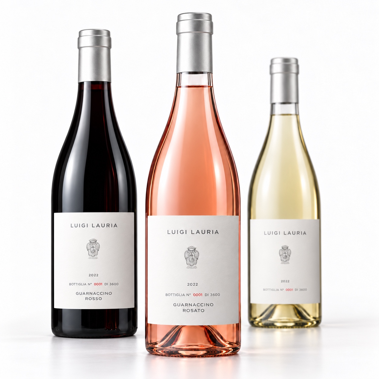
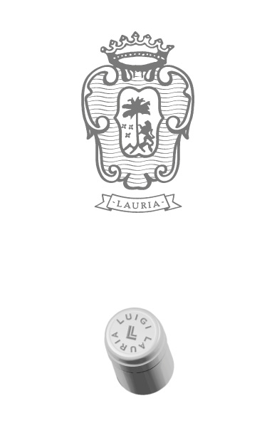
A detailed crest, widely spaced lettering and a restrained white label define the Luigi Lauria wine identity. Silver capsules unite the red, rosé and white wines. A capsule monogram and individually numbered labels complete the design.
LINGUA
FRANCA
Willamette Valley, Oregon
Visual identity, packaging, print and art direction
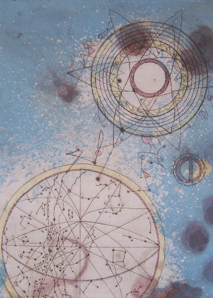
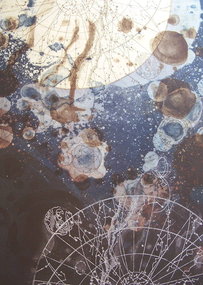
Label artwork by Tallmadge and Chihuly
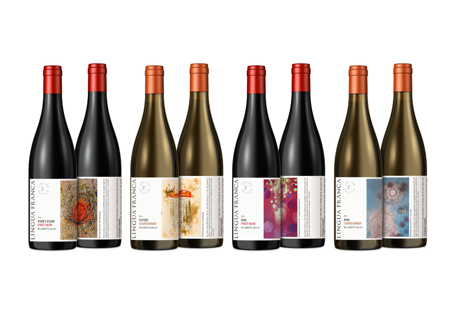
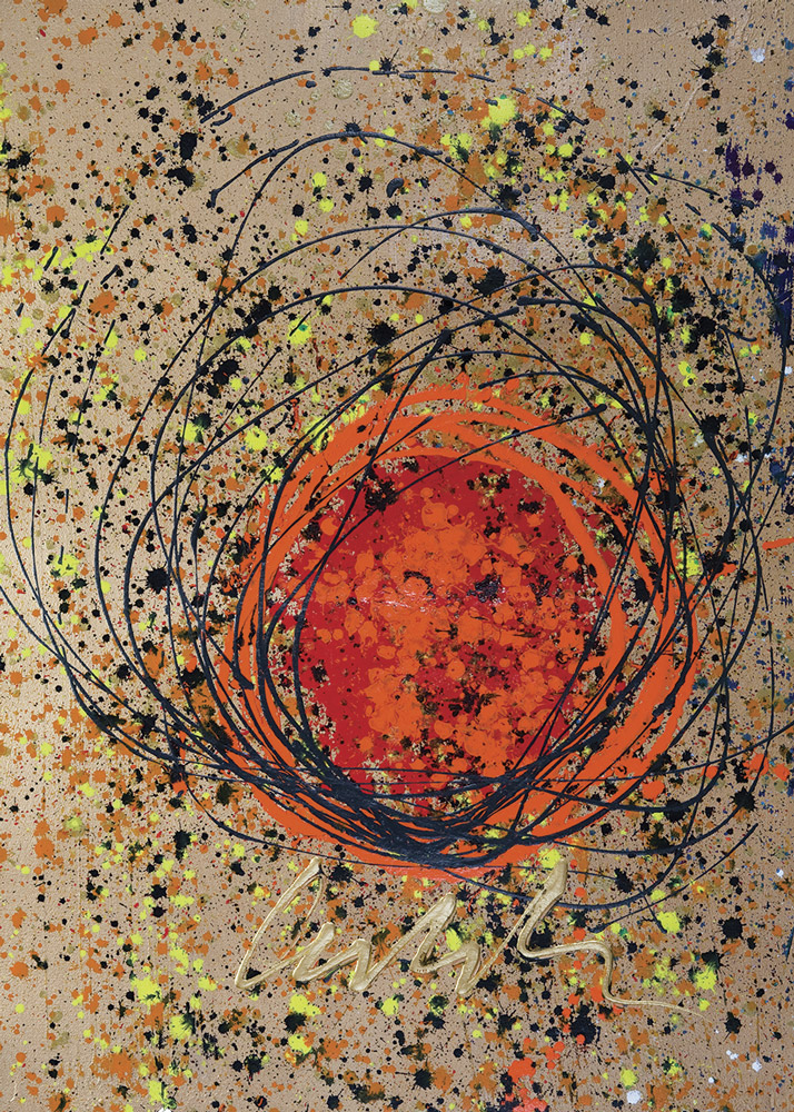
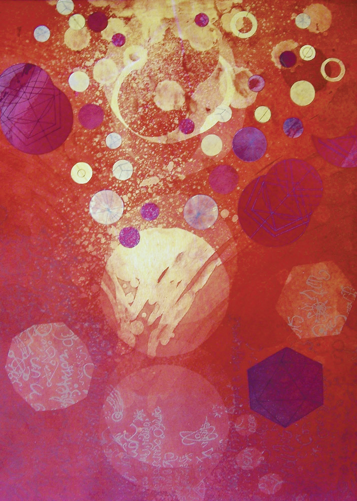
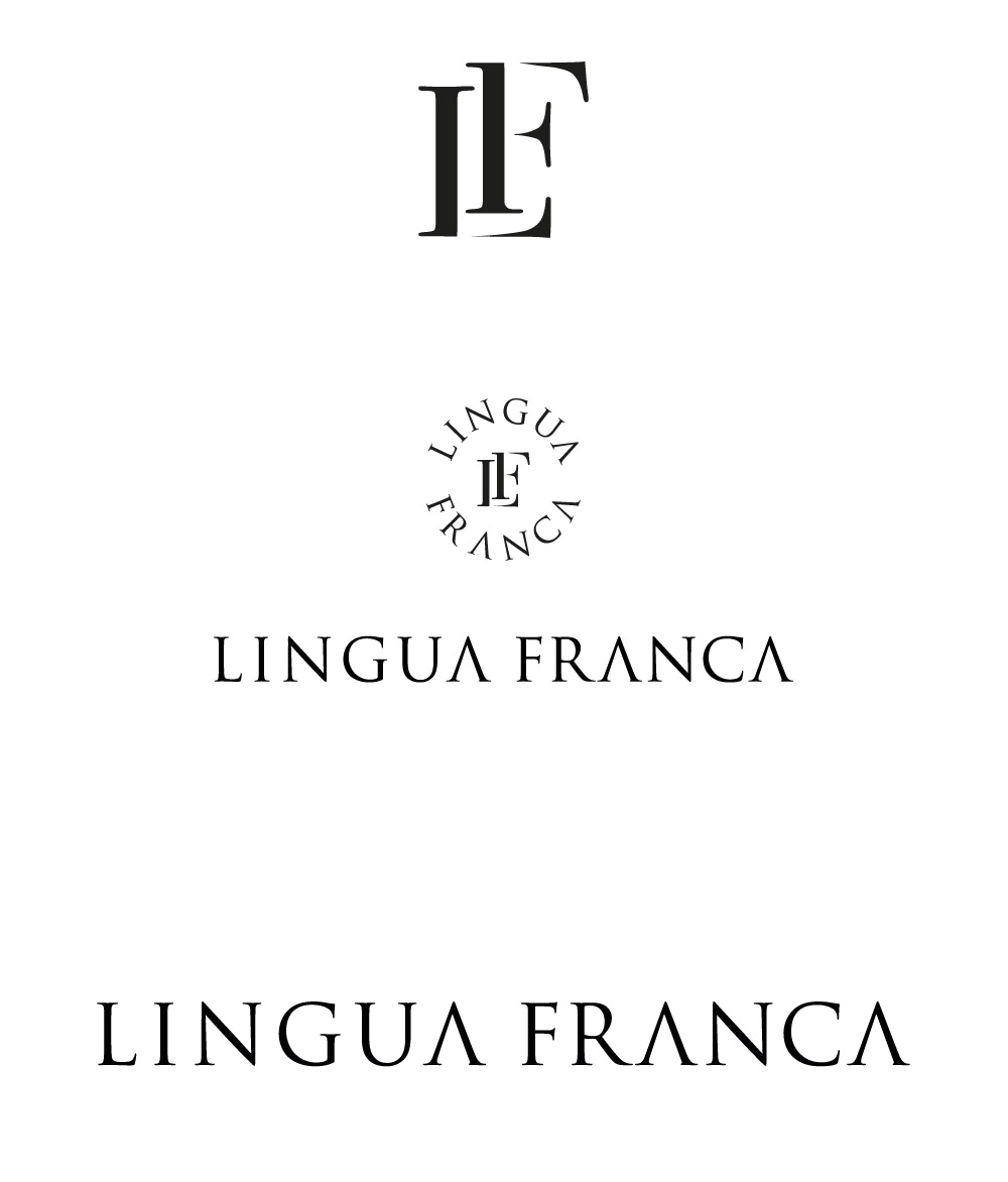
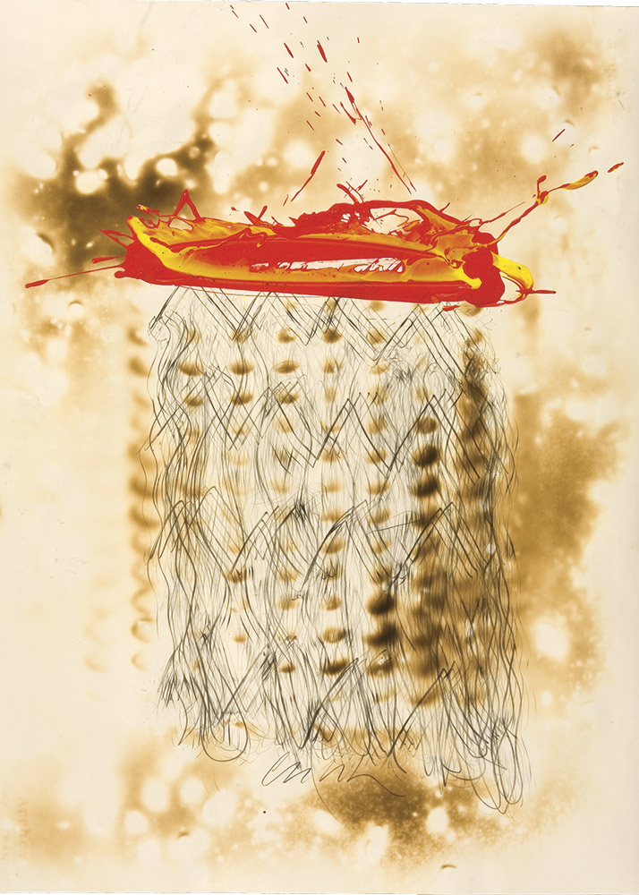
Visual identity, packaging, print and art direction for Lingua Franca, with label artwork by Tallmadge and Chihuly. Restrained typography and a circular monogram frame expressive images. Changes in colour and artwork distinguish the wines, while consistent placement of the name and information connects the range.
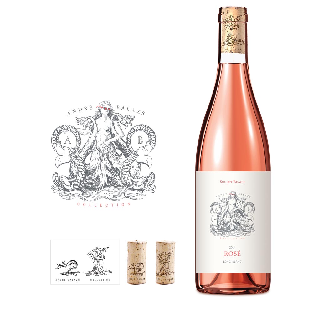
SUNSET BEACH
ROSÉ
Shelter Island, NY
Label artwork, Label design
A rosé wine for the André Balazs collection, with a siren drawing at the heart of its label. The illustration carries the story across the bottle and cork.
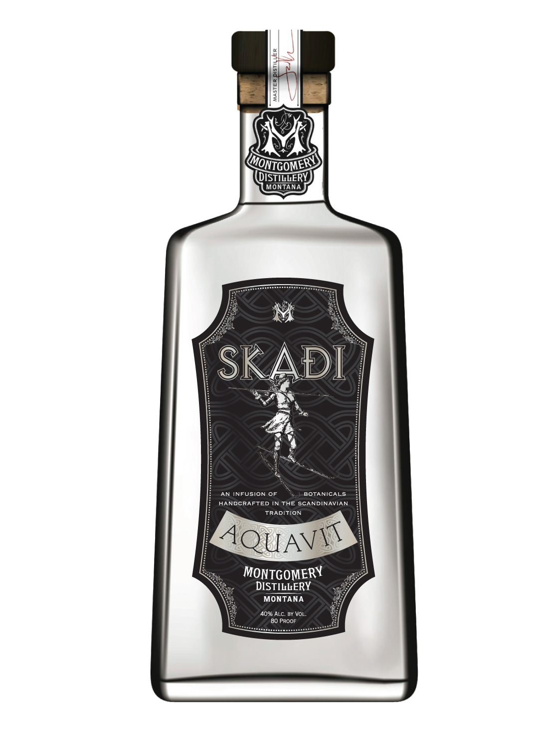
SKADI
AQUAVIT
Montgomery Distillery, Montana
Label and packaging design
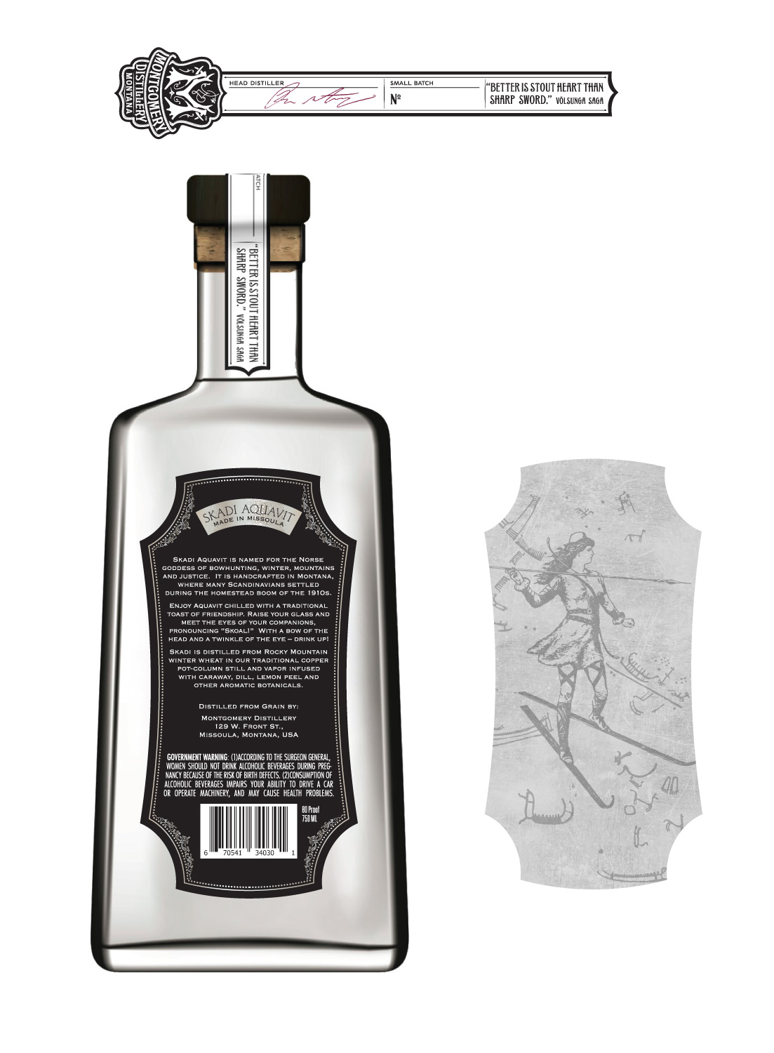
Skadi, the Scandinavian goddess of hunting, appears at the centre of the label. Her figure anchors the dark, intricately patterned design. The bottle labels and neck seal form a coordinated presentation for Montgomery Distillery.
DIRECTOR’S
CUT
Visual identity, packaging, print and art direction
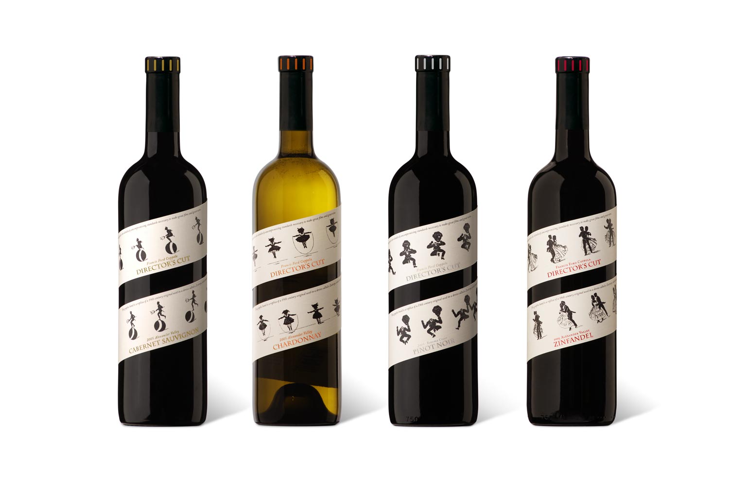
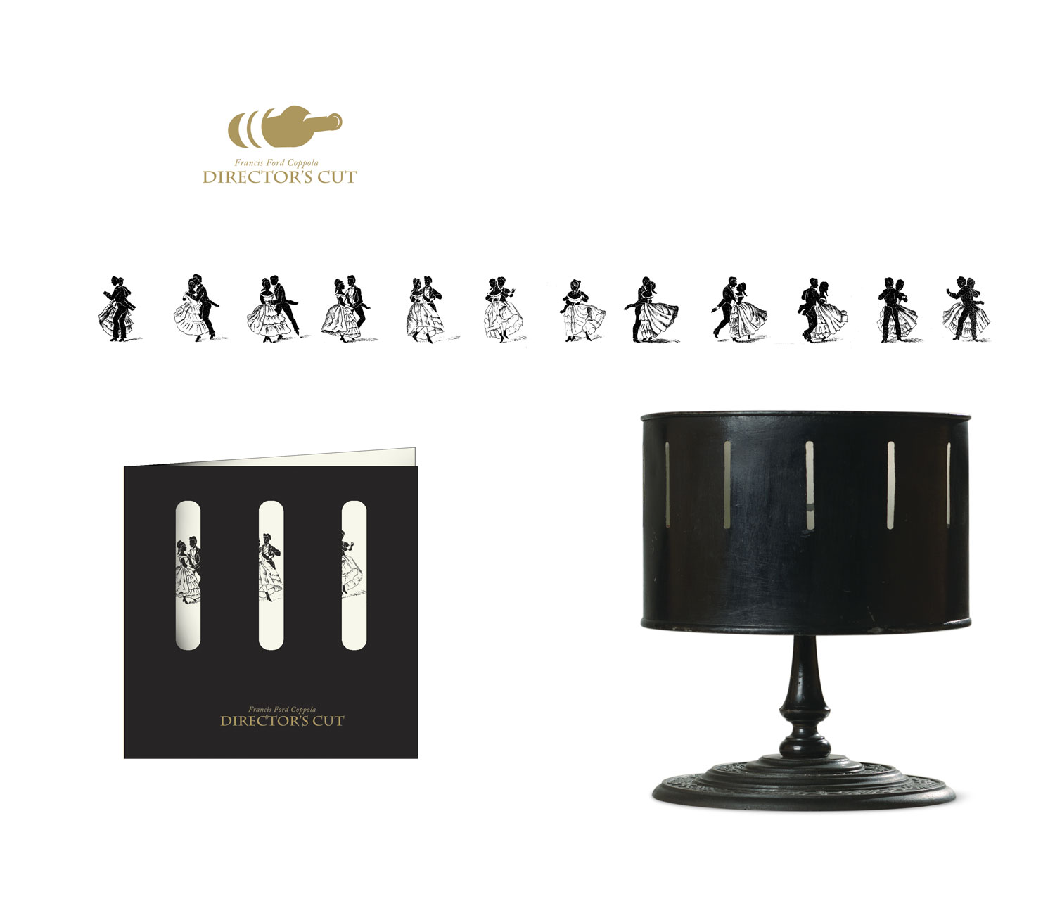
Visual identity, packaging, print and art direction for Francis Ford Coppola’s Director’s Cut wines. Illustrated figures unfold around the bottles on spiralling cream labels, with small colour accents distinguishing the range. The logo, printed piece and sequence of dancers extend the same visual language across the collection.

FRANCIS
COPPOLA
RESERVE
Visual identity, packaging, print and art direction
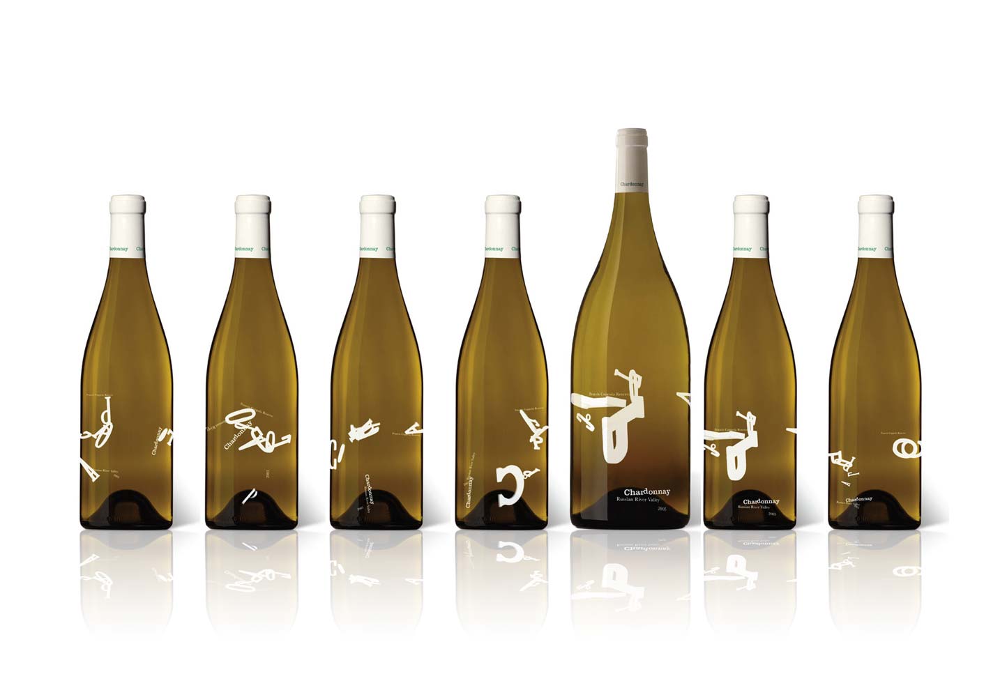
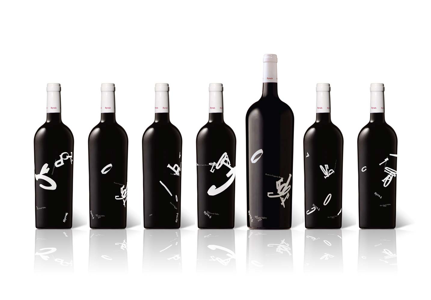
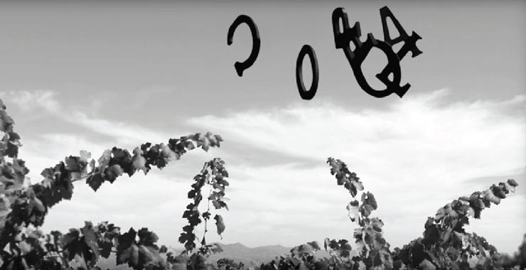
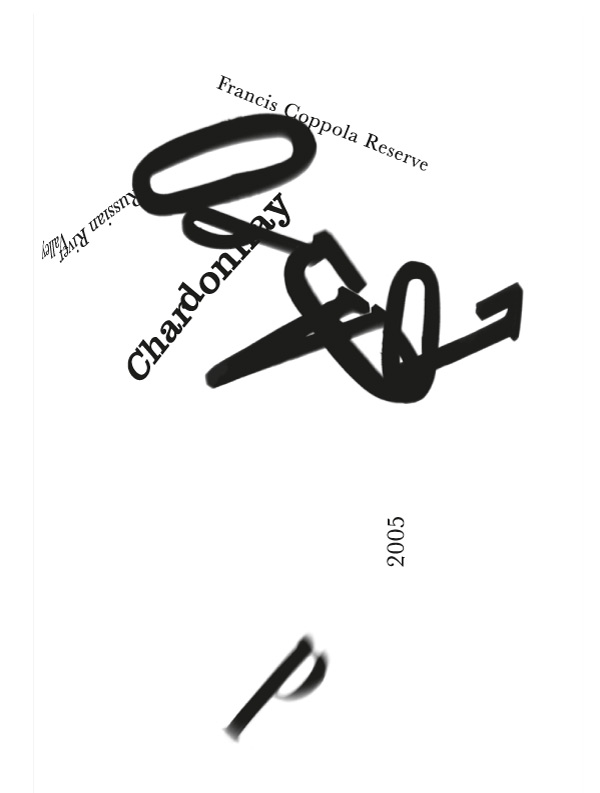
For Francis Coppola Reserve, we threw the letters of COPPOLA into the air and photographed them in flight. The selected images were printed directly on the bottles. Each arrangement captures a different moment, bringing movement and variation to the range.

RC RESERVE
By Roman Coppola
Label design
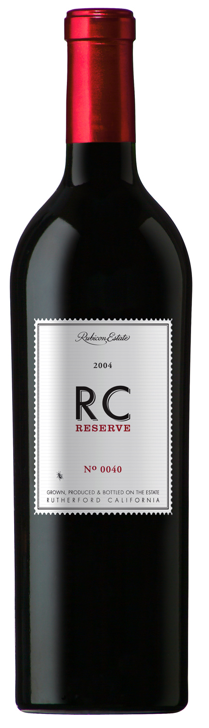
A silver-toned label with a fine border and prominent RC initials defines RC Reserve by Roman Coppola. Red accents echo the capsule. A small spider adds a playful detail: its position on the label changes with every vintage.

CLARET
Packaging redesign
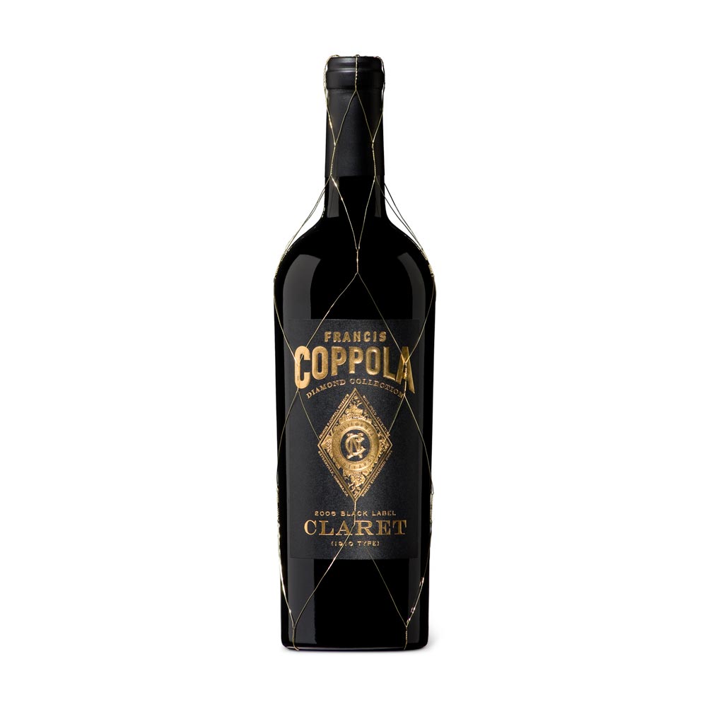
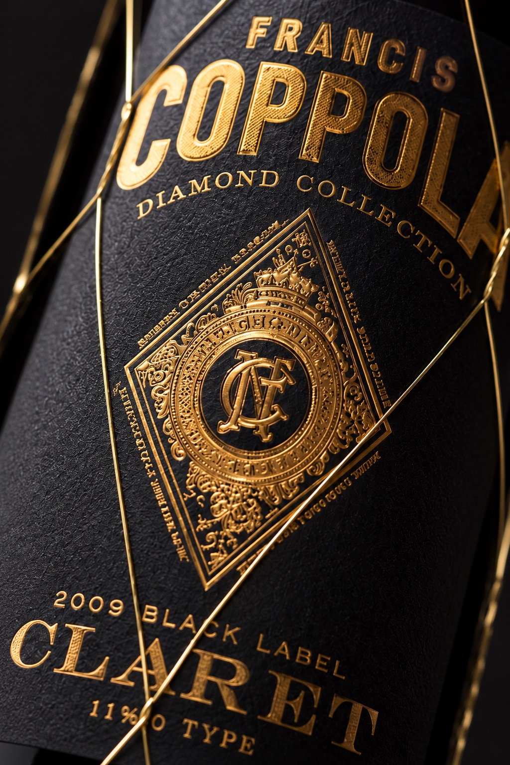
A packaging redesign for Francis Coppola Claret, using matte black paper and gold foil embossing. The finish gives the label greater depth and definition, framed by the bottle’s fine gold wire net.
RUBICON
ESTATE
Visual identity, packaging, print and art direction
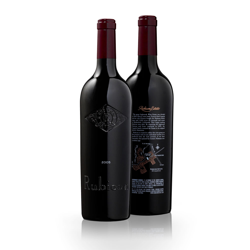
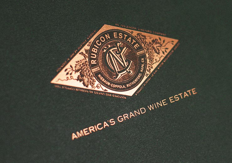
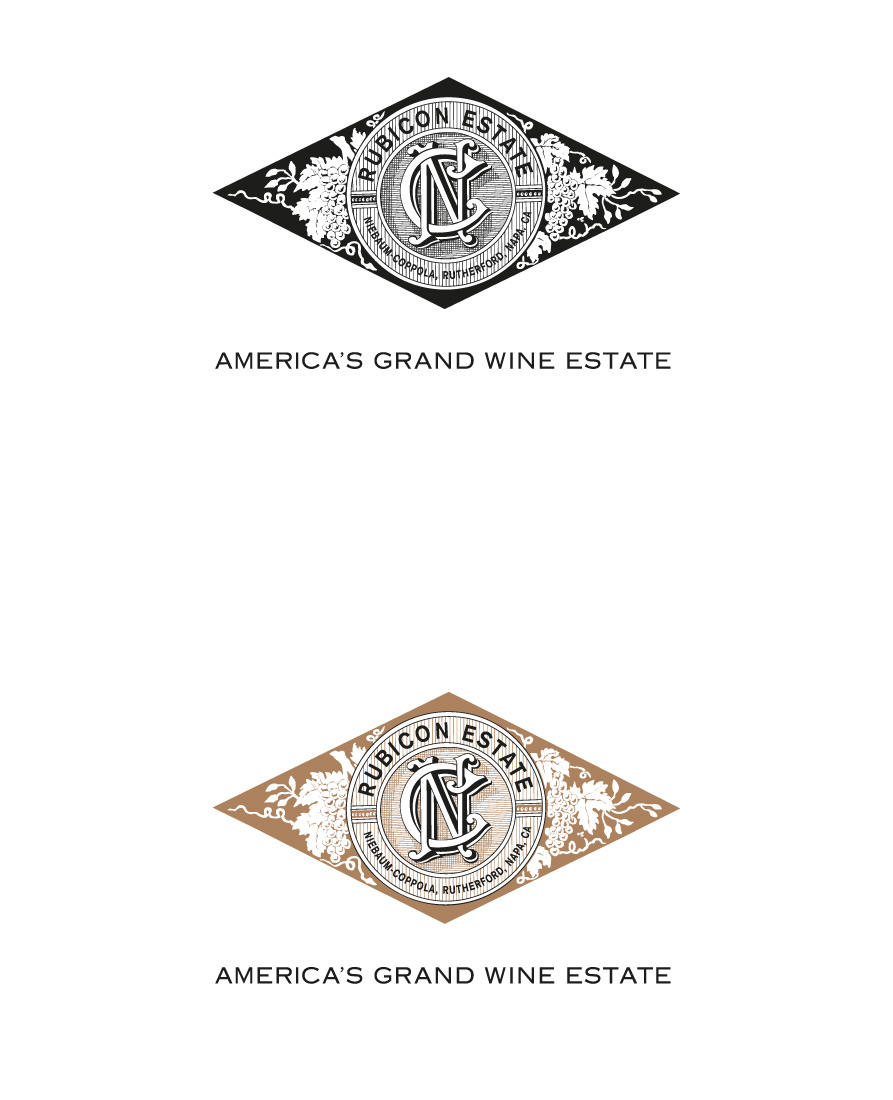
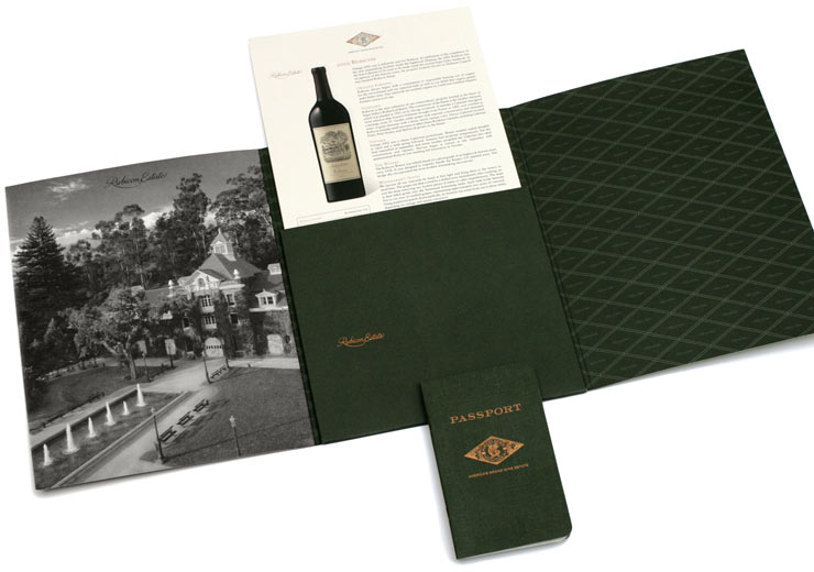
Visual identity, packaging, print and art direction for Rubicon Estate. A diamond-shaped emblem connects the dark glass bottles with the printed materials, while copper tones and deep green give the collection a consistent palette. The identity extends across the bottle, presentation folder, guest passport and packaging.
THE FAMILY
COPPOLA
HIDEAWAYS
Visual identity, packaging, print, art direction and photography
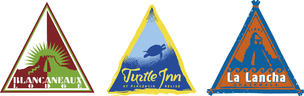
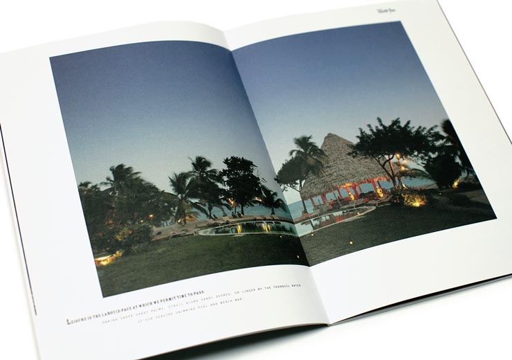
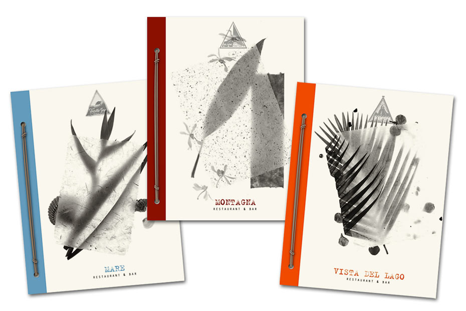
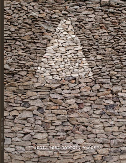
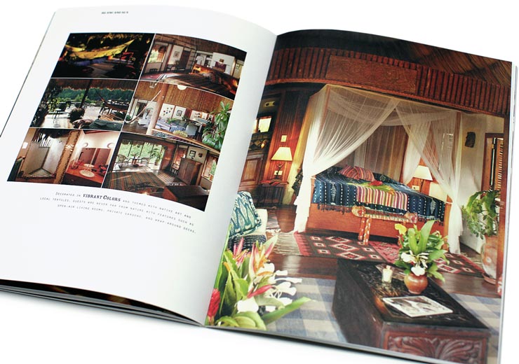
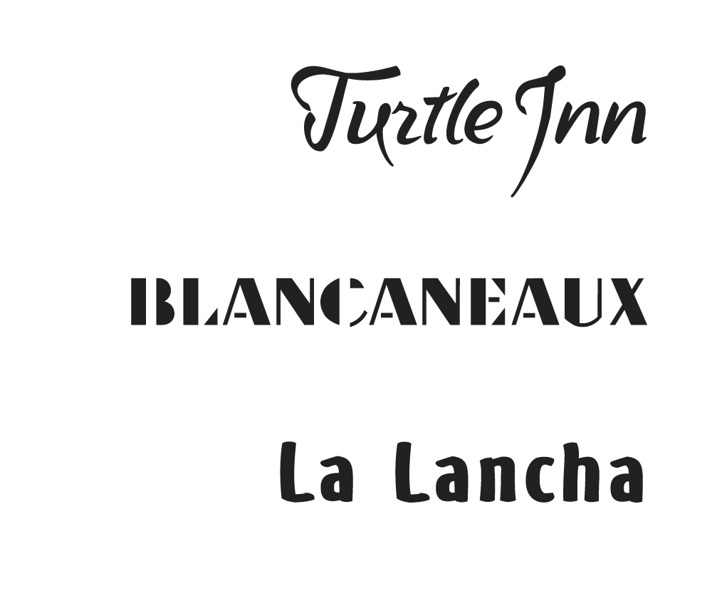
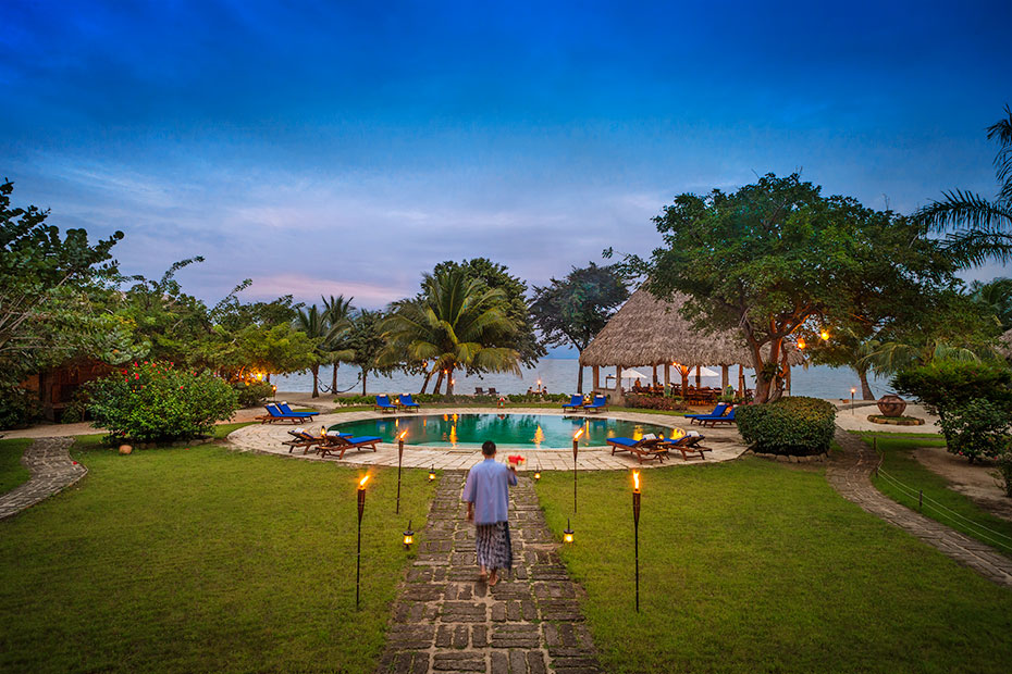
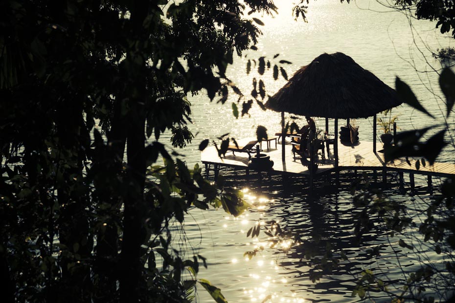
My work for The Family Coppola Hideaways brings together visual identity, packaging, print, art direction and photography. The identities for Blancaneaux Lodge, Turtle Inn and La Lancha each have their own forms and colours. Photography and printed materials connect these identities to the places, from landscape and architecture to the details of the guest experience.

MANAWA
NETWORKS
Toronto, Canada
Visual identity and print
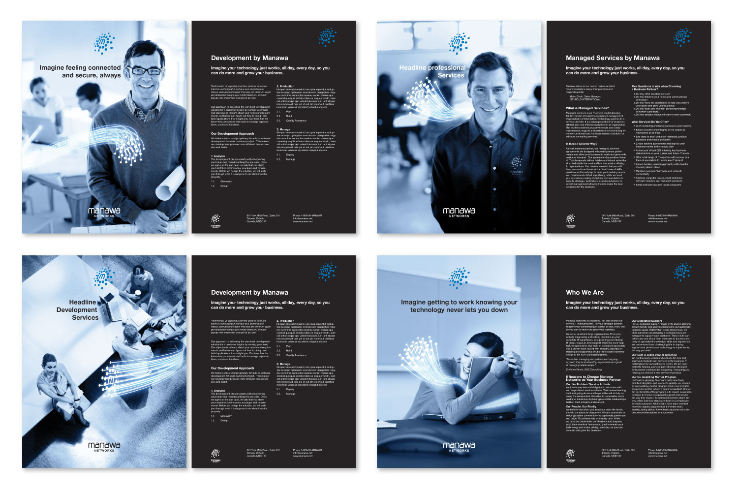
The Manawa Networks identity pairs a blue dotted symbol with a restrained black wordmark. Across stationery and sales materials, these elements connect a varied set of communications. Blue-toned photography and flowing light graphics extend the visual language, while white space and dark panels give the information a clear structure.

CAPTAIN’S
RESERVE
Label design
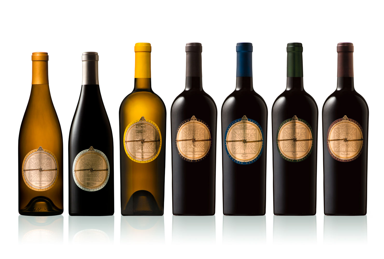
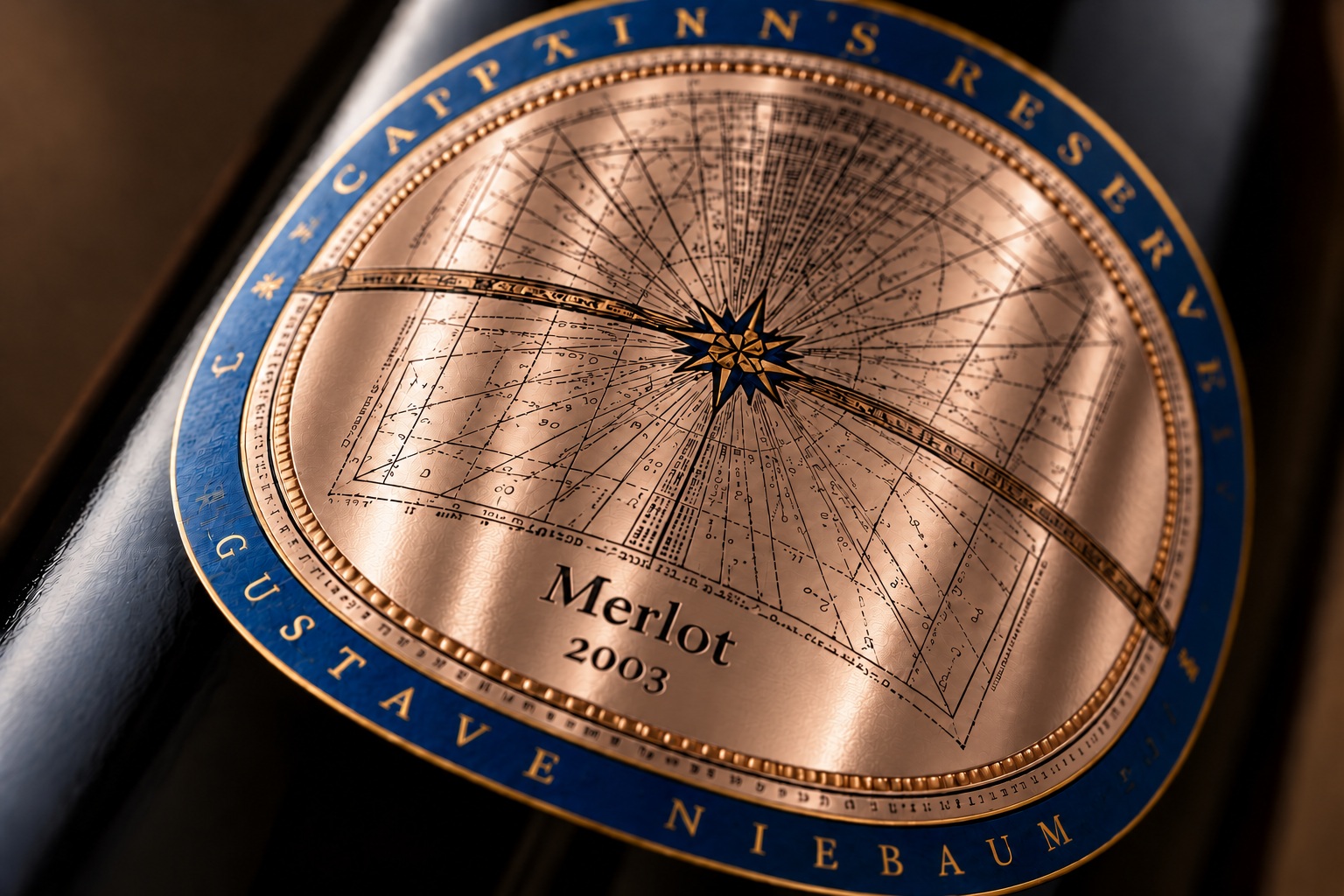
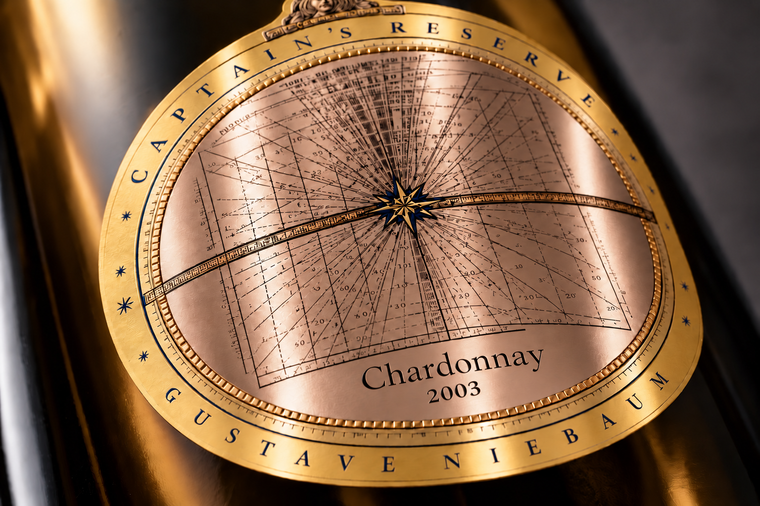
The Captain’s Reserve label is based on a vintage astrolabe. Its circular design brings the instrument’s fine markings into the wine label, with colour distinguishing the wines. Light embossing adds subtle relief and texture to the metallic paper.
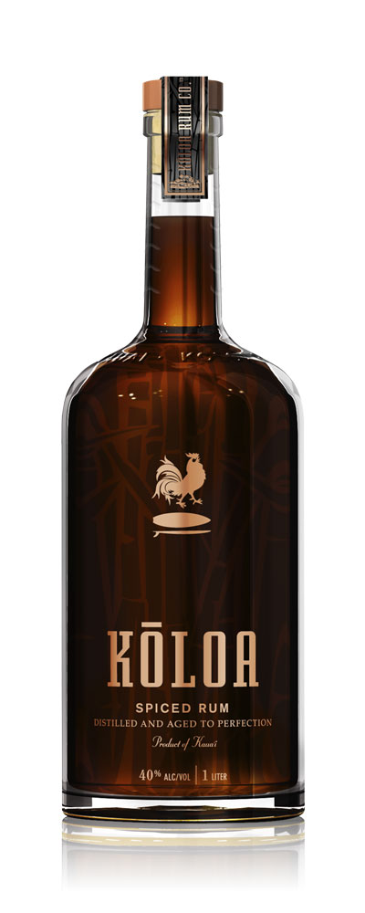
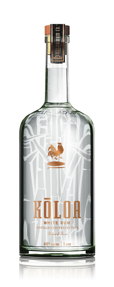
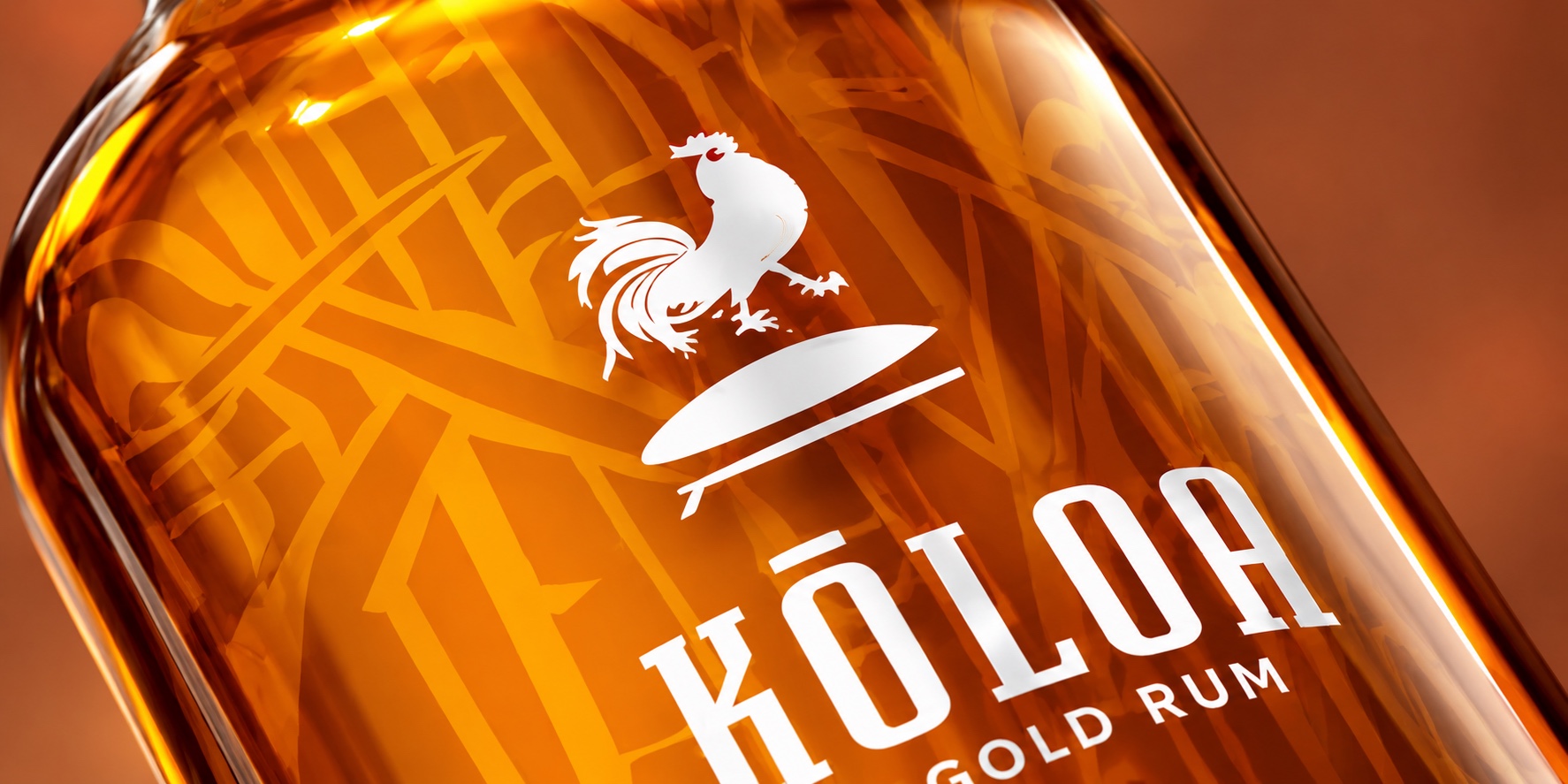
KŌLOA
Visual identity and packaging
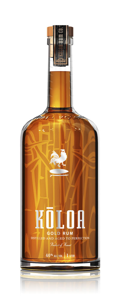
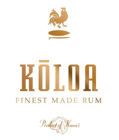
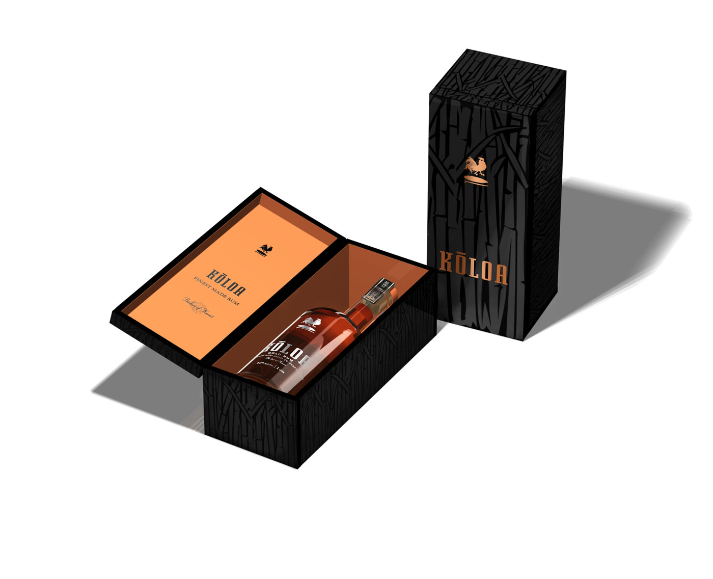
The Kōloa identity brings together a rooster emblem, a distinctive wordmark and a repeating sugarcane pattern. Across Gold, Spiced and White Rum, colour and transparency give each bottle its own character within a shared design. Copper details and dark patterned gift boxes carry the identity beyond the bottle.
GRAPHICS

American Zoetrope Classics
Logo design for the American Zoetrope Classics DVD collection.
André Balazs Collection
Logo design for the André Balazs Collection.
Coppola Hideaways — Shellphone
Shellphone logo design for Coppola Hideaways.
El Real Vineyard
Logo design for El Real Vineyard.
Francis Ford Coppola Presents
Logo design for Francis Ford Coppola Presents.
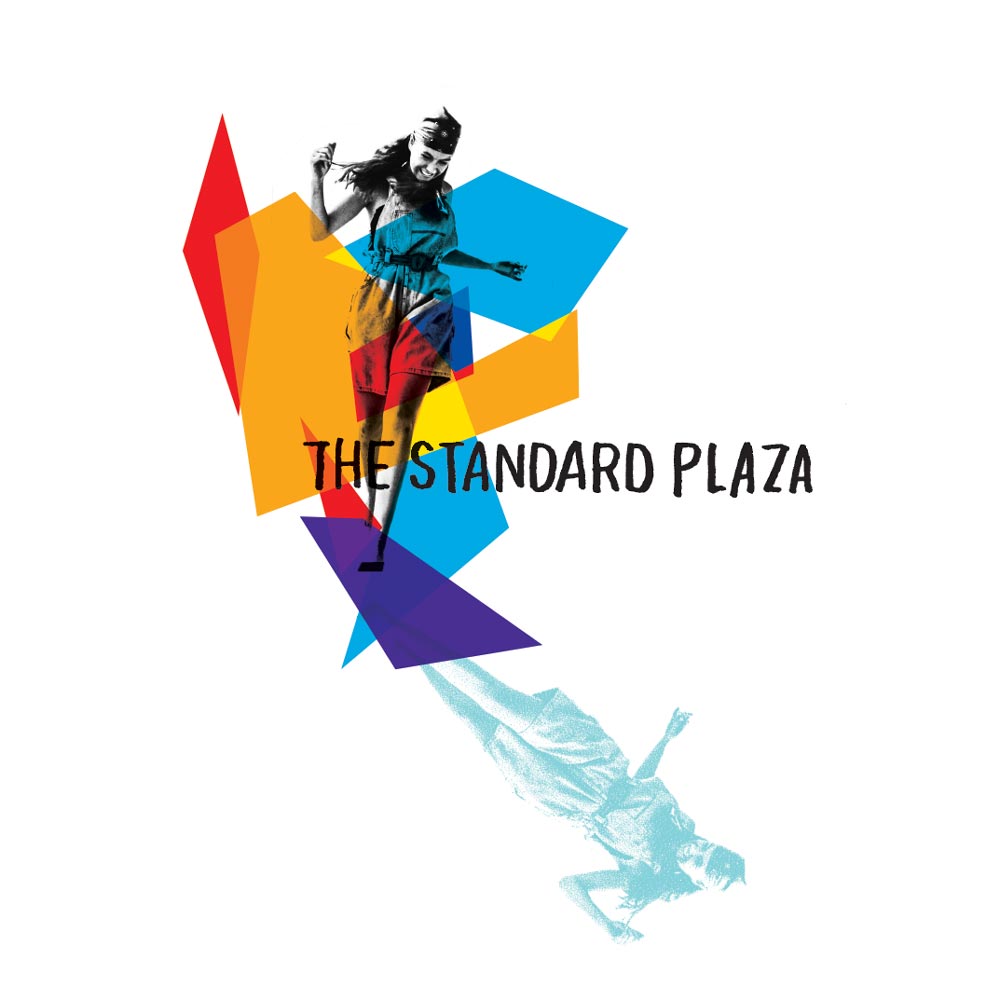
The Standard Plaza, New York — Cover
Cover graphics for The Standard Plaza in New York.
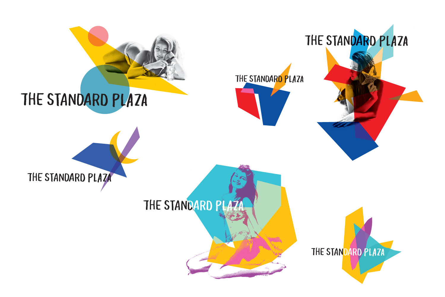
The Standard Plaza, New York
Graphic designs for The Standard Plaza in New York.
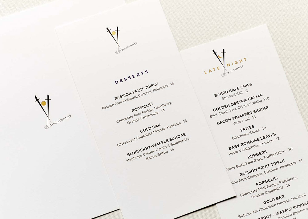
Top of the Standard, New York — Menus
Menu design for Top of the Standard in New York.
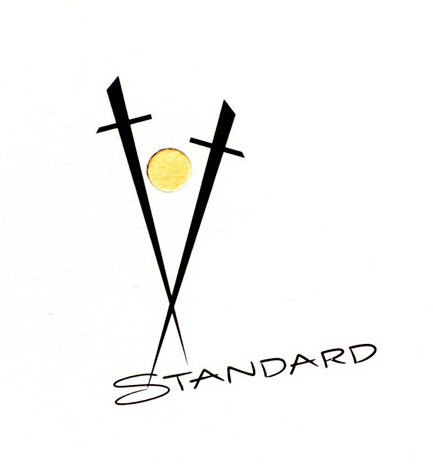
Top of the Standard, New York — Logo
Logo design for Top of the Standard in New York.